Toronto is often perceived by many as “full and dense”, with “no space left for growth”. As an architect and urban planner, I frequently hear these assertions, along with suggestions to direct growth to smaller cities that supposedly “have more room”. This perspective is fundamentally flawed. Toronto not only has plenty of space, but much of this space is also located in areas with existing transit access. The real issue is the lack of will to acknowledge and utilize this available space to alleviate our housing crisis. To understand the city’s true capacity, we analyzed how many more homes could be added near existing transit by setting aside restrictive planning policies. The City’s Official Plan directs almost all intensification to a mere 8.5% of the city’s land, designated as Mixed Use and Apartment Neighbourhoods. In contrast, areas labeled as “Neighbourhoods” – often code for single-family home zones – remain off-limits to intensification despite their proximity to good transit access. For decades, growth and development in Toronto have followed this pattern. We asked ourselves, what if we considered land use capacity near transit, irrespective of these arbitrary designations? By utilizing all the space with easy transit access, we could create high-quality communities with diverse housing options suitable for people at all stages of life. Such an approach would make Toronto a more equitable, liveable, and welcoming city.
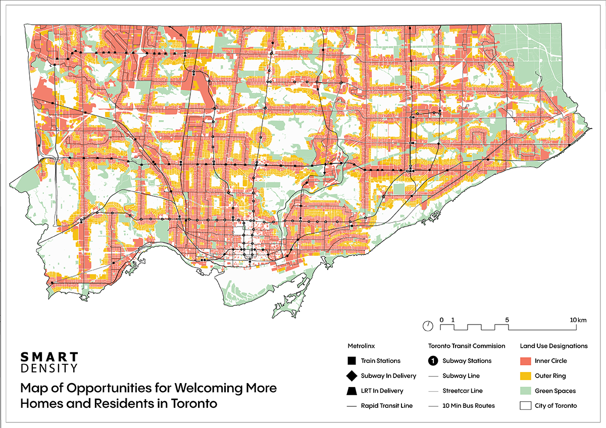
Our study revealed that Toronto has the potential to add significant capacity near transit without compromising quality of life. Our ‘Welcoming More Homes and Residents’ map shows that we are far from reaching capacity. Specifically, Toronto hypothetically has room to accommodate 7.6 million new homes and 12 million residents across 273 km².
Although we won't build to this extent, it highlights the inaccuracy of the claim that the city is full.
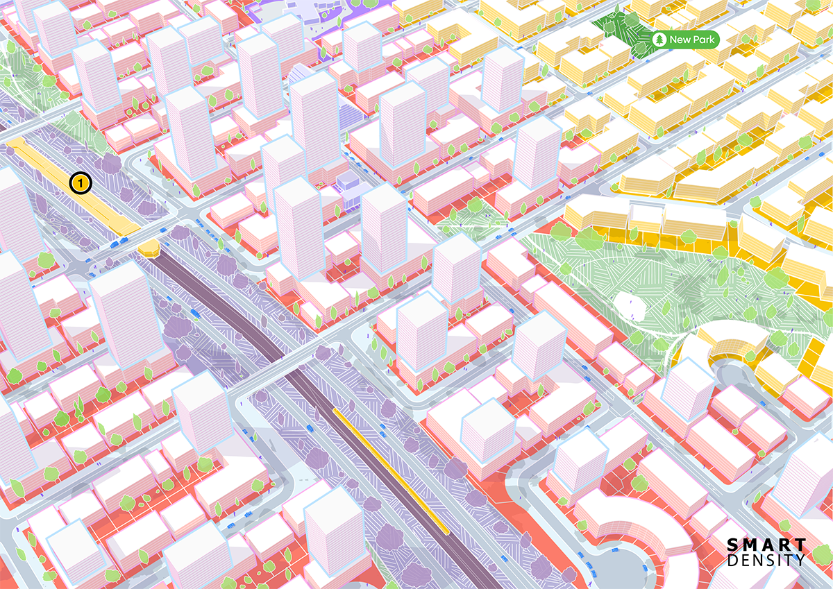
By focusing on growth in transit-accessible areas, we can better utilize underdeveloped lands and meet future demand. Our approach started with land near transit, within 400 and 800 meters of rapid transit (GO, LRT, subway) and 250 and 400 meters of frequent transit (streetcars and frequent buses). We included all land near transit, excluding areas unlikely to be redeveloped due to factors like heritage designations or steep slopes. With data from Ratio.City, a division of Esri Canada, we identified suitable areas, conservatively assuming 30% of the land would be undevelopable. Our new map features four key colours: inner circle, outer ring, open space, and everything else. The inner circle represents areas closest to transit stations where development should be concentrated, while the outer ring includes areas slightly farther out but still suitable for significant development. This map reveals the hidden capacity across the city.
Halting growth won’t solve our housing and affordability issues or address the long-standing planning and investment decisions that have led us here. People will continue to move to Toronto, and if we don’t build, it will result in massive displacement and a city affordable only to the wealthy. To those who claim we’re maxed out, we assert that we have the space – it’s time to make the most of it.
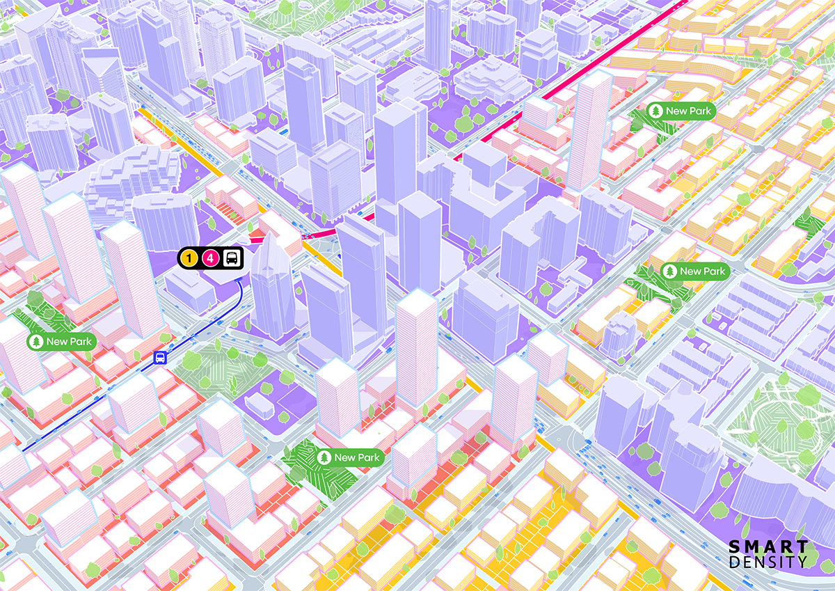
Capacity Demonstration (Station 2)
We use cookies to ensure that we give you the best experience on our website. If you continue to use this site we will assume that you are happy with it.OkNoPrivacy policy